← FATEMEH BEHBOODIAN
Work Contact
CASE STUDY
FINTECH
DASHBOARD
2026

Vamax

A credit and installment dashboard for people who cannot calculate an interest rate, and should not have to.
ROLE
UI/UX design, end to end
CONTEXT
Ehsan Ezzati's Advanced UI/UX course, team project
OUTPUT
Dashboard, components, pages
PUBLISHED
Free on Figma Community
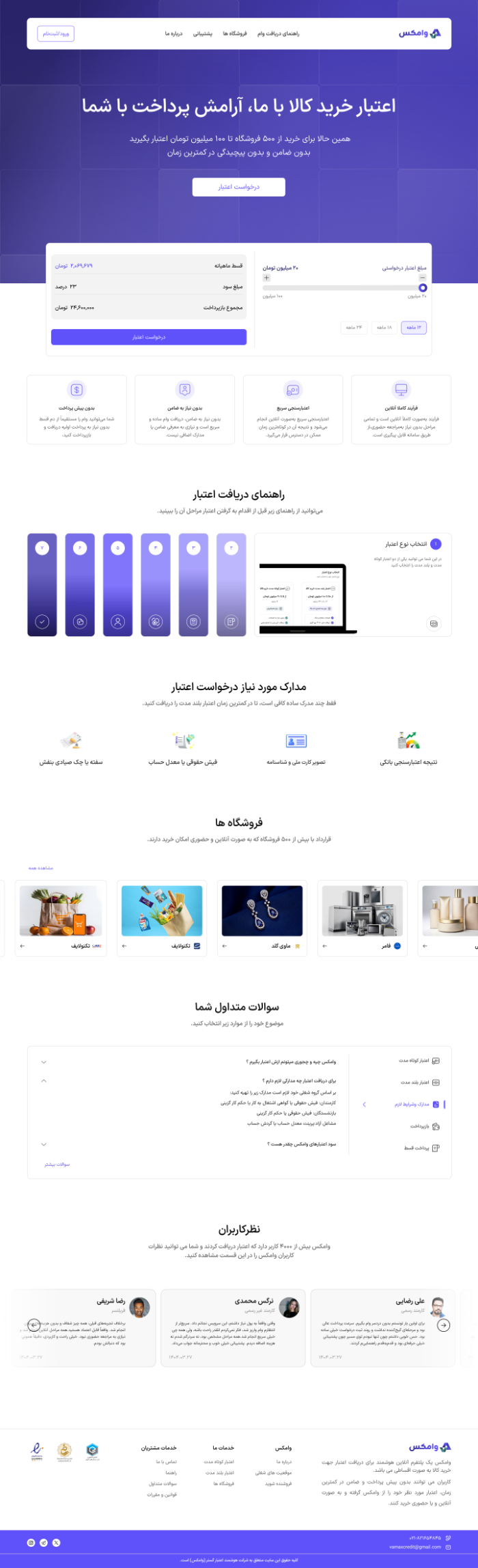
Vamax landing page
LANDING PAGE — APPLY FOR CREDIT, CALCULATE INSTALLMENTS, BROWSE PARTNERED STORES
00 — OVERVIEW

Vamax – Fintech Loan Management Dashboard

Vamax is a collaborative fintech project completed as part of Ehsan Ezzati's Advanced UI/UX Design course. The project was recognized as one of the top submissions and was later published on the Figma Community.

The platform was designed to simplify the management of both short-term and long-term loans, with a primary focus on creating an intuitive and scalable dashboard experience. Users can seamlessly apply for loans, track repayment schedules, purchase products using loan credit, and monitor their financial status through a centralized interface.

01 — THE NAME

Vam, the Persian word for loan. Plus X, the crossing point.

The X stands for the intersection between lenders and the people borrowing from them. Blue carries trust and calm; green carries growth. Nothing in the palette is decorative.

PRIMARY
Blue
Trust, security, calm
ACCENT
Green
Growth, prosperity
02 — THE PROBLEM

Buying on credit was slow, opaque, and easy to get wrong.

01
Choosing the wrong credit

Pick badly and you are locked into a repayment that is too long or too expensive.

02
Numbers nobody can read

Interest rates, repayment periods, installment amounts. All of it hidden in banking language.

03
Two kinds of shopper

Some want to buy online. Some want to walk into the store. The product had to serve both.

03 — WHAT I DESIGNED

Three decisions, each removing one thing to think about.

SOLUTION 01

Two credit cards you can compare at a glance

Short-term and long-term, side by side, in the same visual language. The choice becomes a comparison instead of a calculation.
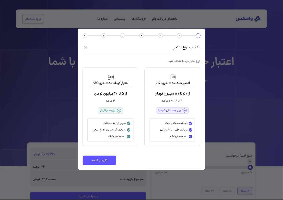
Choosing between short-term and long-term credit
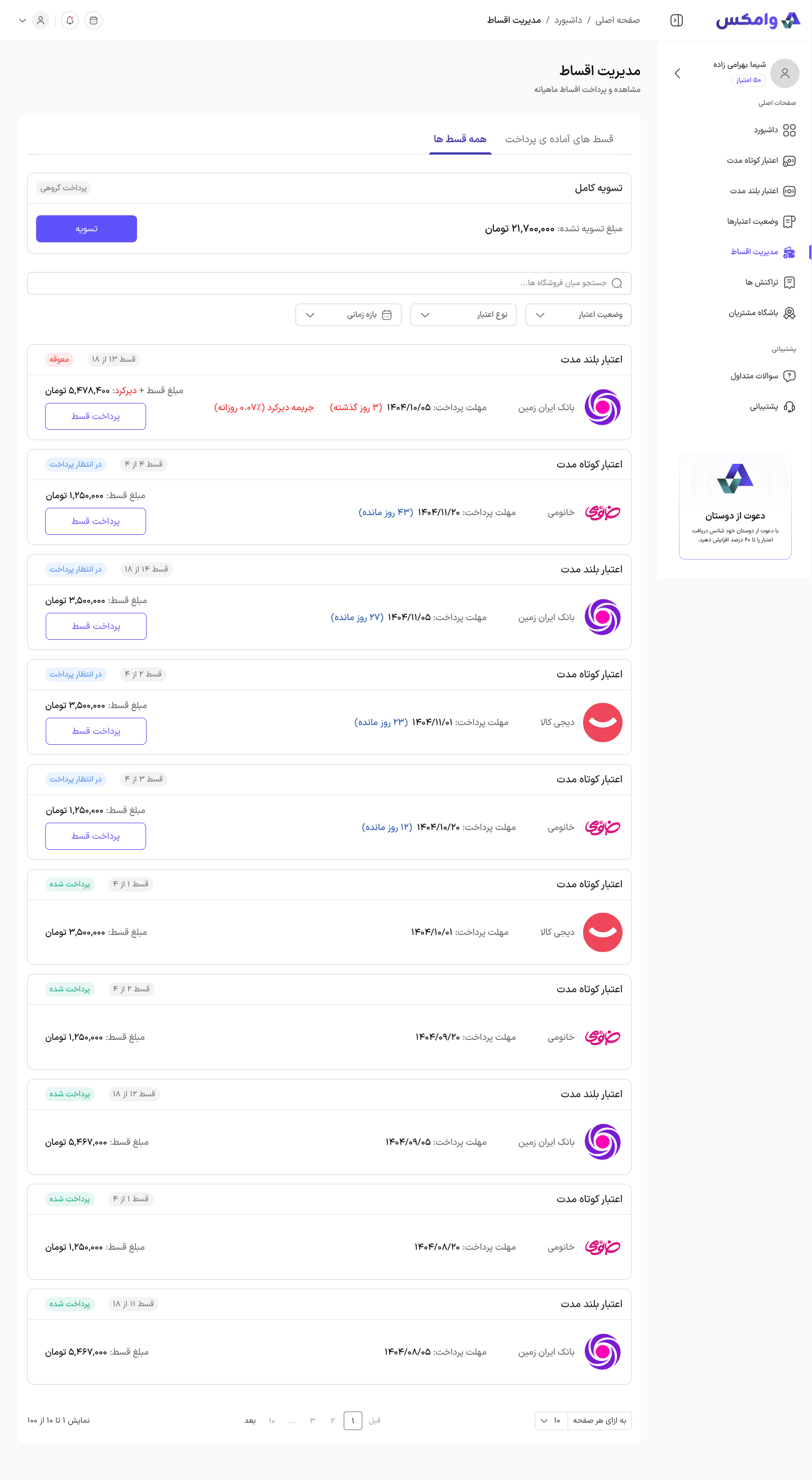
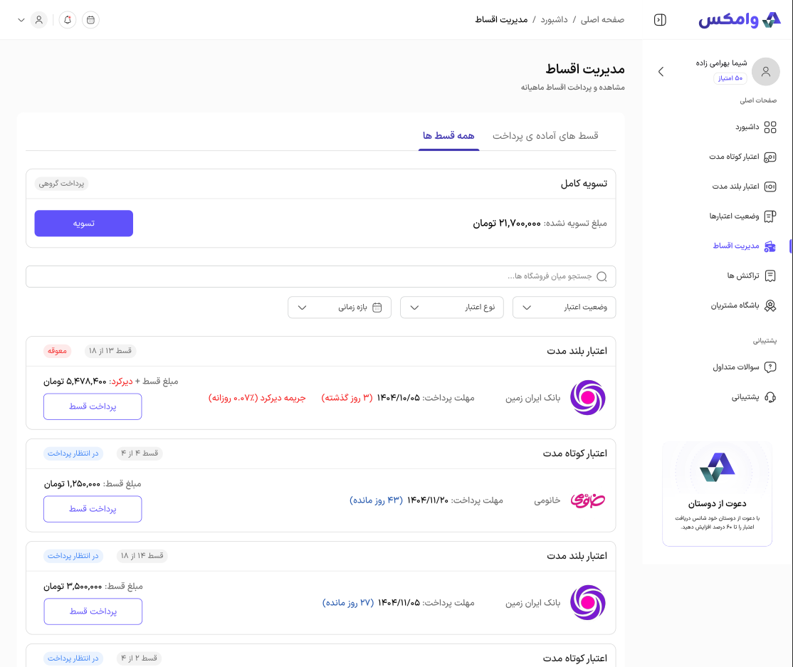
Installment management screen
SOLUTION 02

Every installment, its date, and its late fee

Repayment lives in one list: which credit it belongs to, how many installments are left, days remaining or days overdue, and the penalty being charged. Settling everything at once is one button away.

SOLUTION 03

Online and in-store, in one Stores section

Partnered merchants appear together with the way you can buy from them, so the shopping habit never forces a detour.
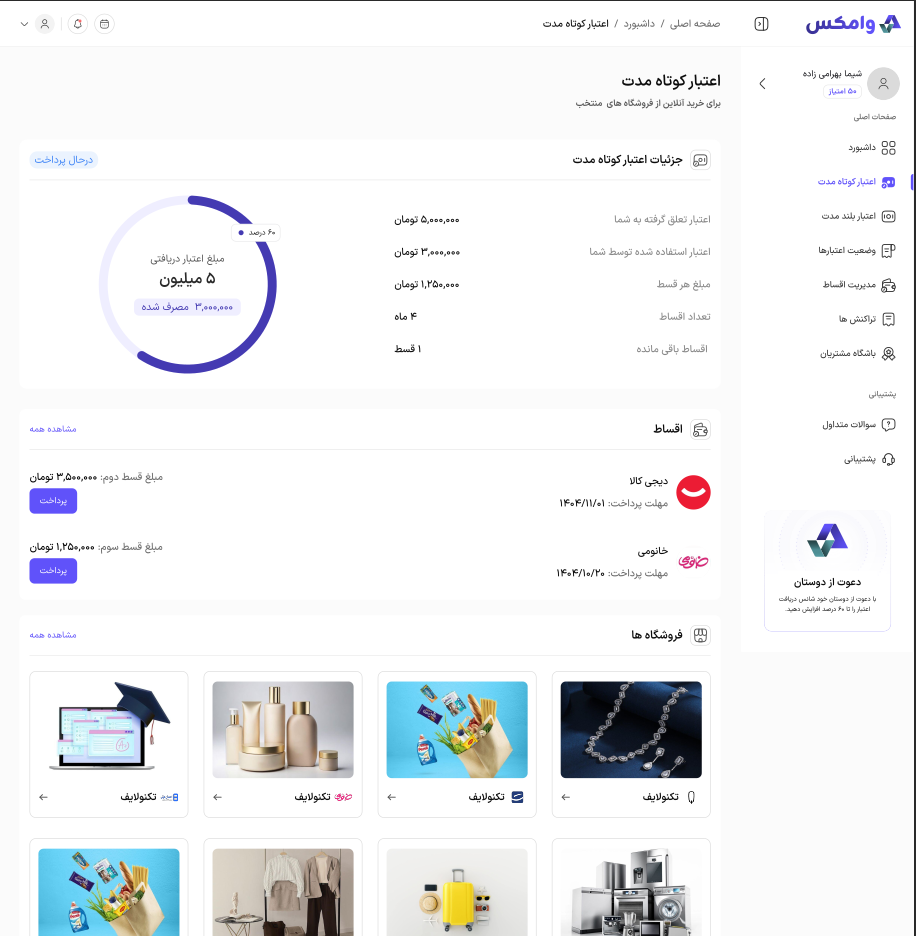
Short-term credit detail with partnered stores
MORE SCREENS

The rest of the dashboard, built to the same system.
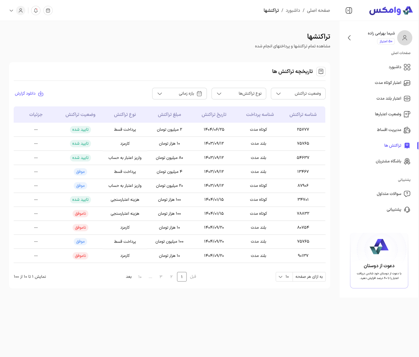
Transactions history
Transaction history — every payment, top-up and fee, filterable by type and status
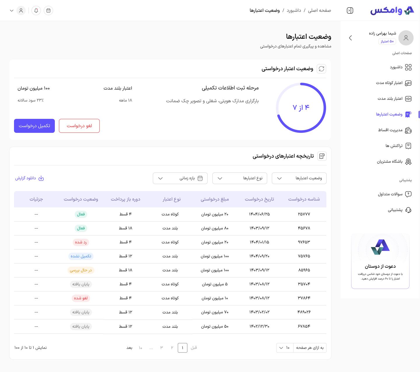
Credit request status
Request status — track every credit application from submission to activation
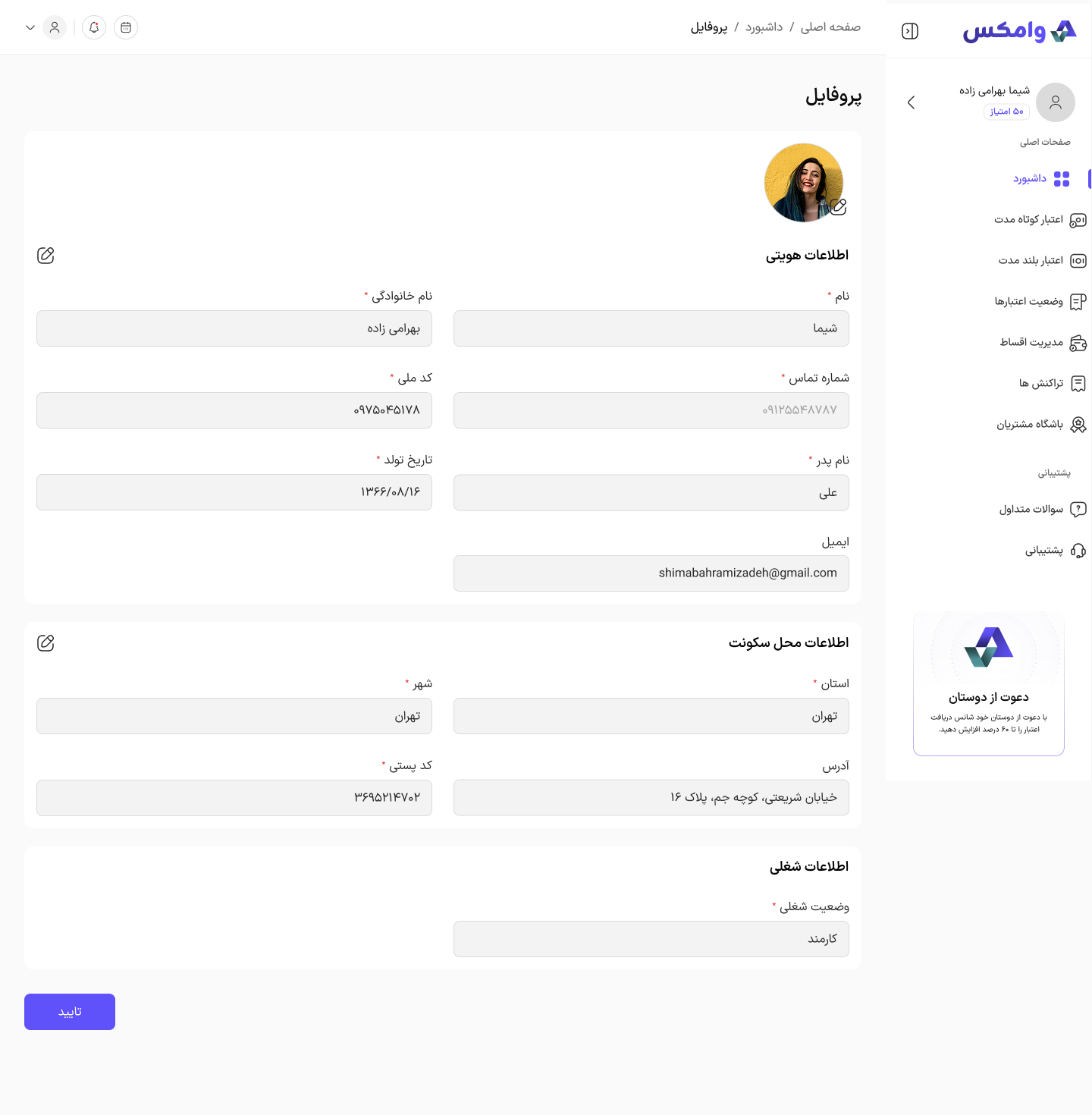
Profile page
Profile — identity, residence and employment information in one editable form
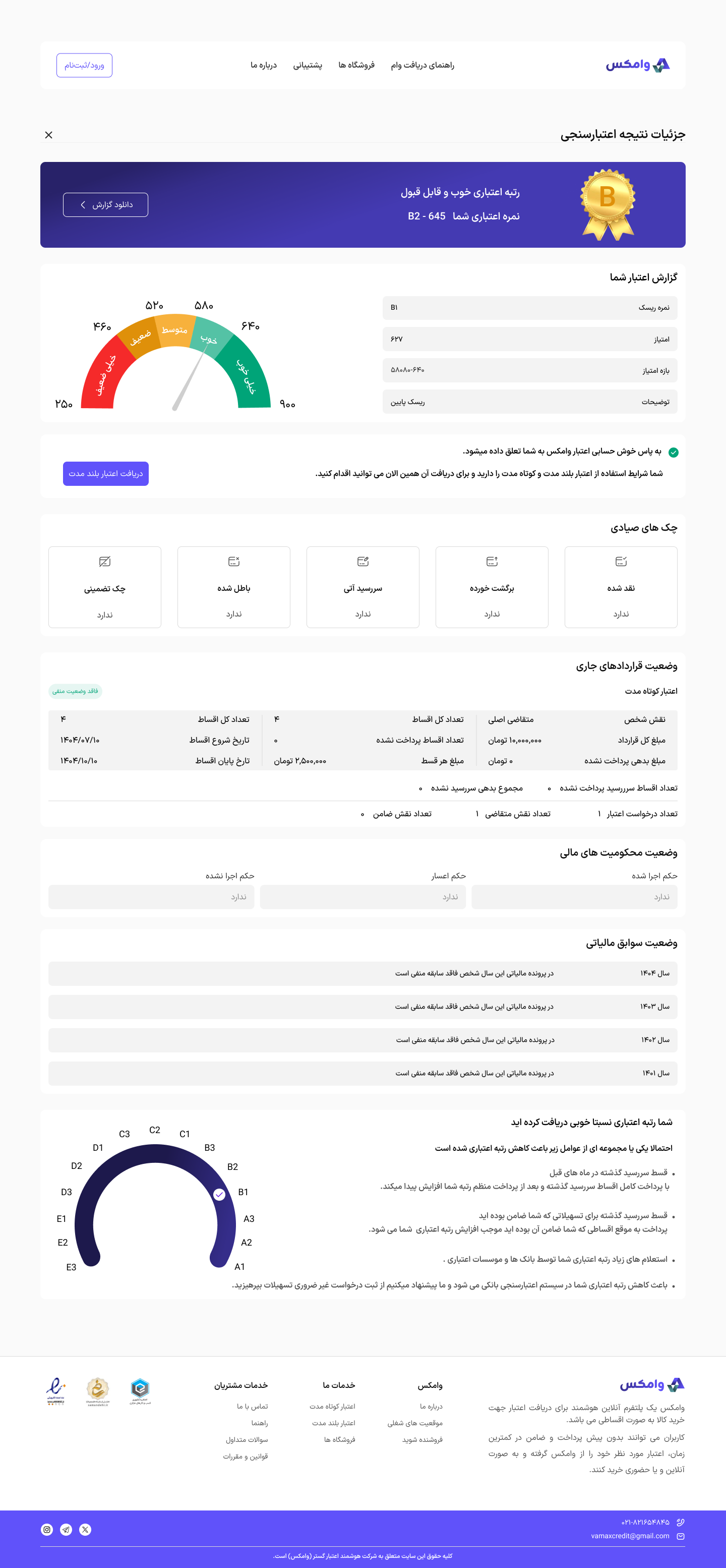
Credit score and validation details
Validation result — the credit score explained, with the factors behind it
Installment management, full list
Installment management — every installment across all active credits, with due dates and one-tap settlement
MY CONTRIBUTIONS
Dashboard UI/UX design
Loan management and repayment flows
Product purchase with loan credit
Wireframing and user flow refinement
Interactive prototyping
Design system implementation
DESIGN HIGHLIGHTS
Fully interactive high-fidelity prototype
50+ reusable components
Organized Color Styles and design tokens
Extensive use of Auto Layout for scalability
Consistent design system for maintainability and future development

This project strengthened my experience in designing complex financial products, building scalable UI systems, and creating user-centered experiences for data-heavy dashboards.

04 — WHAT GUIDED IT

Money is emotional. The interface should be boring.

Every screen answers one question and then gets out of the way.
A
Build trust visually

Consistent structure, generous spacing, no surprises between steps.

B
Show the whole number

Totals, fees and dates stated plainly, at the moment of the decision.

C
Cut the mental load

High readability over density. Fewer choices per screen, better labels.

D
Hand off cleanly

Organised components and ready-to-use pages, published for other designers.

05 — THE FILE

Published free, so other designers can take it apart.

Components organised, pages ready to use. 300+ designers have opened it on Figma Community.

Open on Figma Community →
22 saves and counting
Credit selection
Installments
Stores
ADD MORE
FRAMES
NEXT

Want the rest of the work, or a conversation?

Back to all work Get in touch
FATEMEH BEHBOODIAN · VAMAX CASE STUDY
HOME ↑